Carrot2
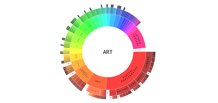
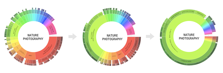
This is a hierarchical pie chart visualization of search results for Carrot2 Clustering Engine. First ring represents root clusters and next levels represents their subclusters and so on. Size of each part on particular ring depends on number of documents in particular cluster. Click on the image above to play with it.
Beside showing ratios between clusters we focused very much on explorative part of the interface. This led to two new features:
Folding / unfolding of groups of clusters. If there are more than just few clusters we merge the least significant ones and add them as a new group in the end. You can then show or hide them by clicking on the grey +/- group.
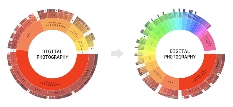
Focusing / zooming in. By double clicking on any cluster we can “focus” on it. This means that other clusters on a given level of depth are shrinked so there is much more space for this cluster and it’s subcluster. It makes everything more readable. Please notice that we have realtime text layouting so labels are always the biggest size possbile.
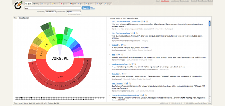
On the website the visualization is presented next to search results:
Visit Carrot2 Clustering Engine.