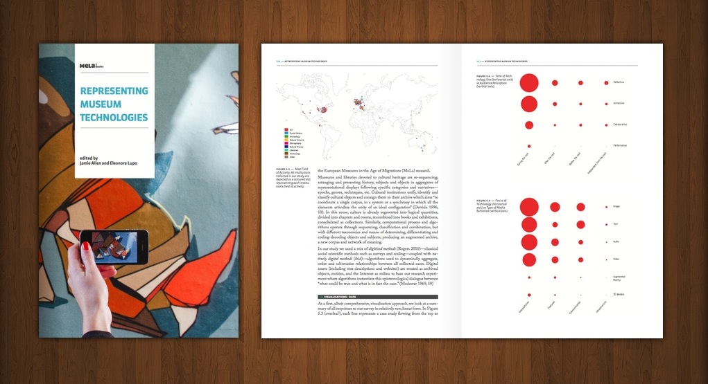
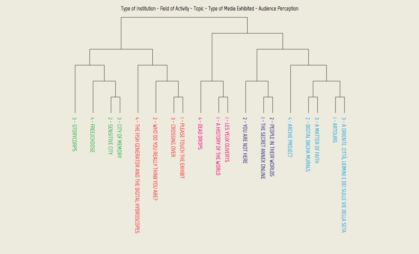
MeLa - Representing Museum Technologies
In August 2012 I collaborated with CIID Research to create a range of visualizations of case-studies data as a part of European Union MeLa project.
MeLa - "European Museums in an age of migrations" is a four year long research project funded by the European Commission. CIID Research was of part of Research Field 05 of the project called "Exhibition Design, Technology of Representation and Experimental Actions" and invited me to help them with building tools to collect, analyze and visualize data they gathered during the research process investigating use of technology in the exhibition space.
The book
Results of our explorations were published in MeLa RF05 Book: Representing Museum Technologies report and can be downloaded on MeLa projects website as PDF.
"Visualisation of Cross-Field Research Data, reflects on the process and consequences of researching museum practice through a set of data-driven algorithm-derived data visualisation of case-study parameters and descriptions." - MeLa
Data Collection
We started by building a mash-up of Google Forms and Google Maps for collecting data about interesting case studies. The website was used by number of researchers from all around the Europe to enter data related to their field of study. Eventually we decided to build a custom front end for Google Forms to have more control over the layout and fix some usability issues (like editing previously added data).
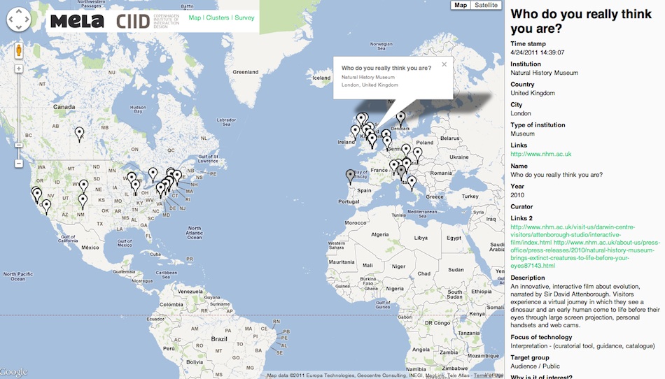
Because Google Forms are powered by Google Docs (now Google Drive), the shared spreadsheet feature combined with easy CSV file export allowed us to quickly visualize the data using JavaScript D3.js library right in the browser.
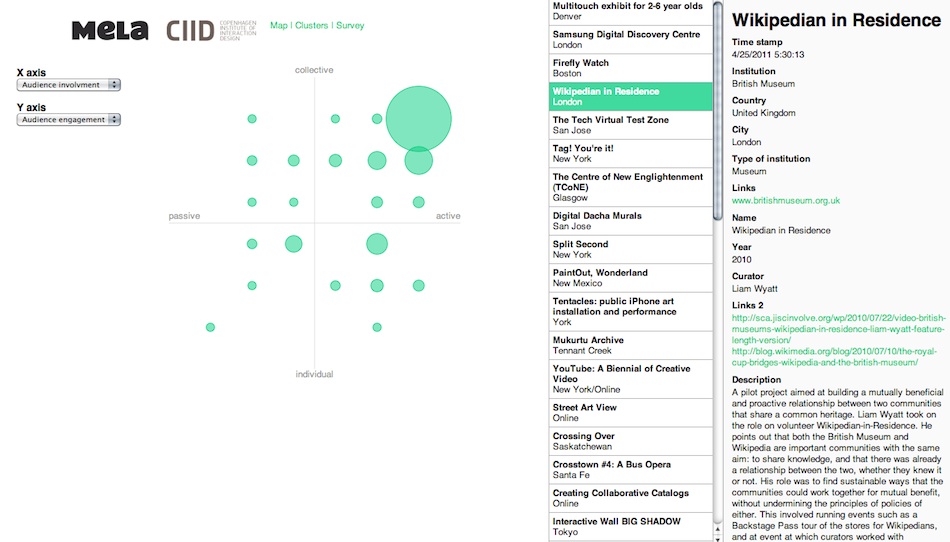 ,Colleration between exhibition audience involvement and collective vs individual aspect of exhibited works.
Data Analysis
Values
The first step was to see what we actually have had collected so we displayed the distribution of all the possible answers for all the questions. Armed with that knowledge we could better choose and design the type of visualization that was appropriate for each piece of data.
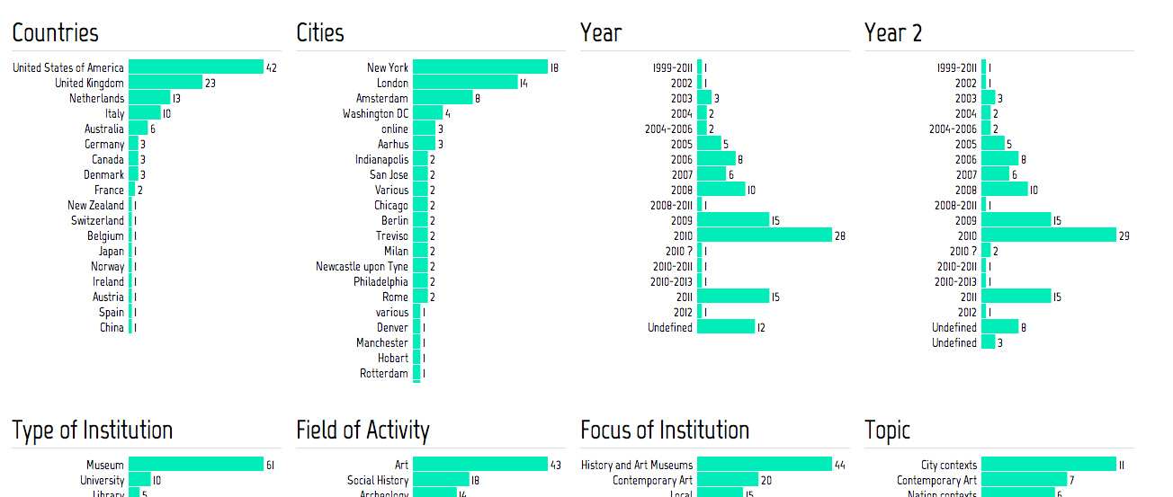 ,Answer distribution
 ,Answer distribution over years the exhibitions took place
Location
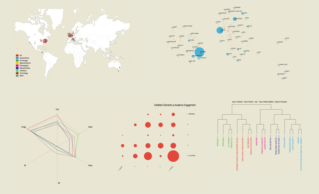
Location visualizations are showing where are the collected exhibitions took place. Most of them happened in New York or London, so we had to come with a layout that doesn't neglect the less popular places.
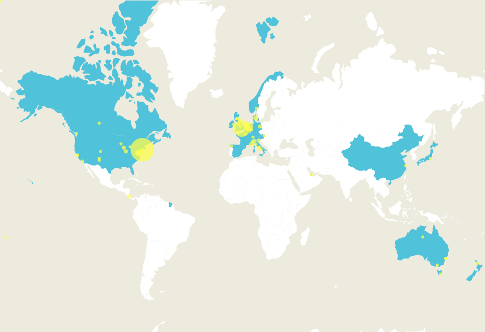 ,Basic visualization where we highlight each country and city that had at least one exhibition. This caused problems with big countries like Canada or China with only one exhibition because wasn't very readable.
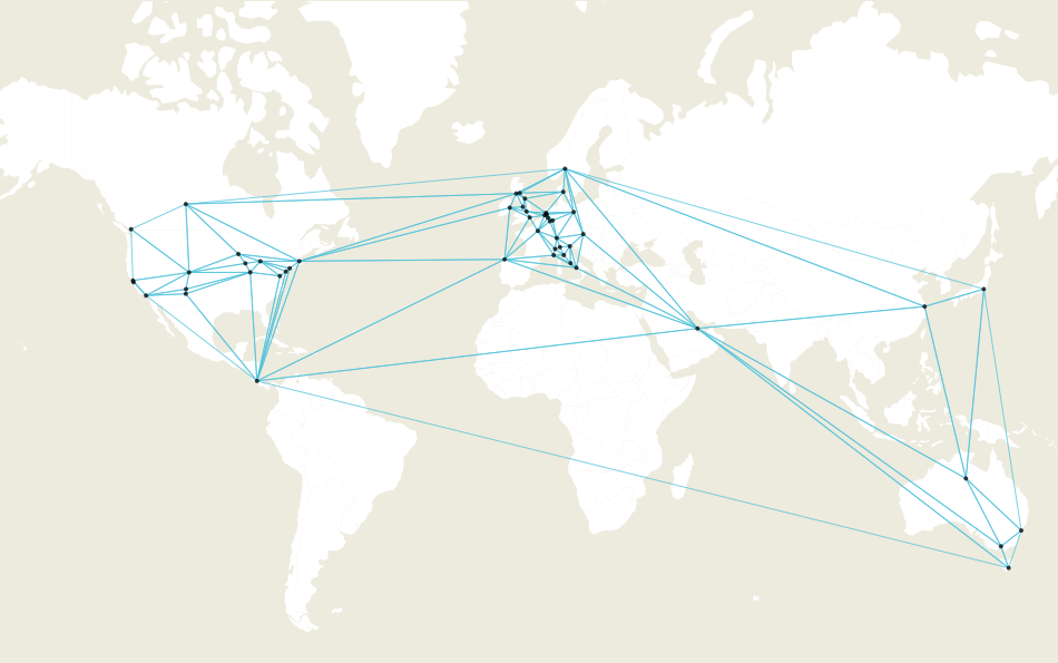 ,Basic triangulation of all the points to get better understanding of topology of museum network.
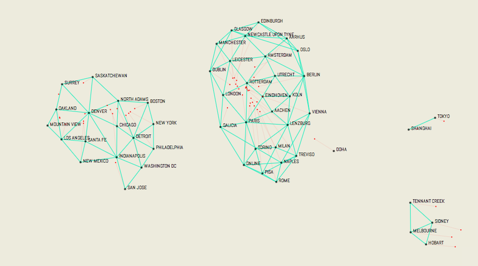 ,Many of the cites are very close to each other so we investigated use of force directed layouts to spread them apart.
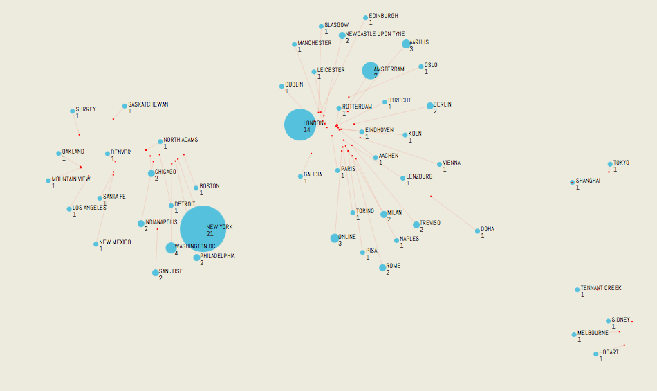 ,Remove the mesh and you get quite nice layout with spatial relationship mostly preserved and no labels overlapping.
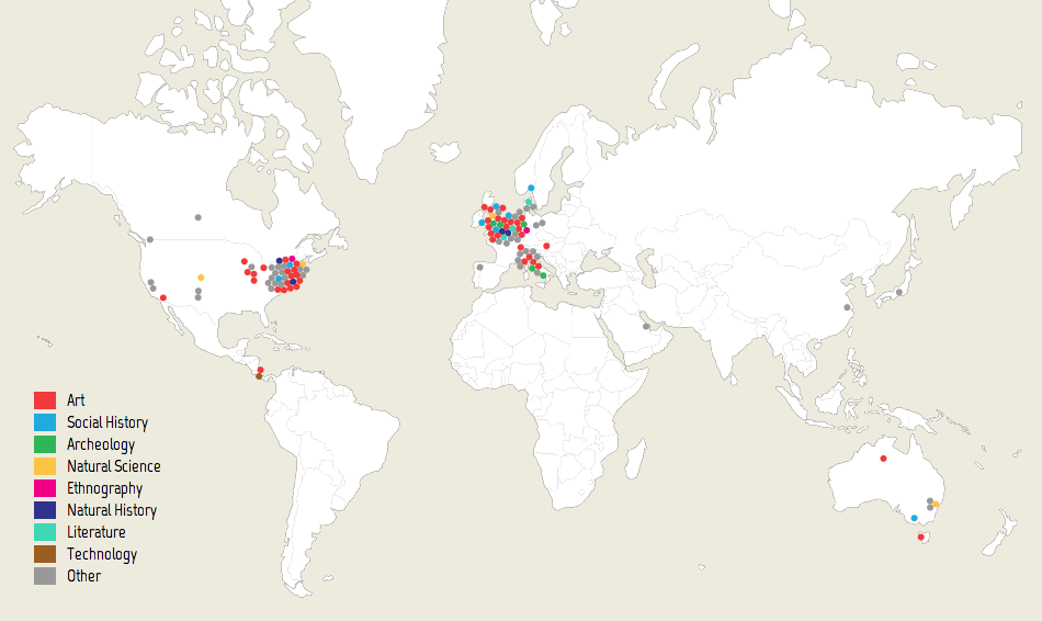 ,Final version with all the exhibitions displayed and color coded by their major topic.
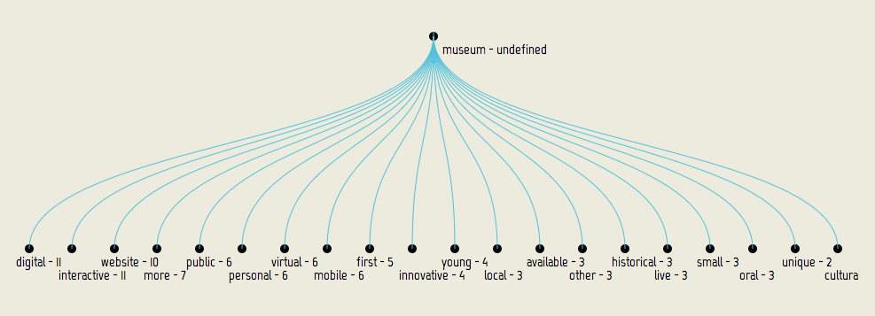
Description text
Next we looked at the words researchers used to describe the exhibitions.
 ,Adjectives describing museum found in the text with number of occurrences.
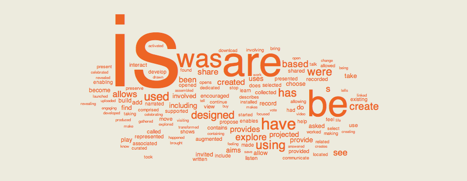 ,Verbs and nouns describing museum found in the text.
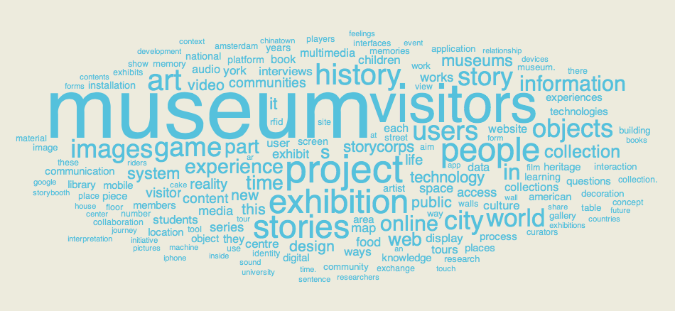 ,Nouns describing museum found in the text.
Topics
In parallel with my work David Gauthier was using R package to computationally extract possible exhibition topics and their clusters. Some examples of th
topic C: stories memory narrated american history city record memories initiative people museum project

topic E: exhibition interactive museum visitors resources cultural institutions technology archive
We then measured how close each exhibition fits these topics and plotted then on a radial chart. Each corner of the polygon is one topic and number of corners represent the number of topics used.
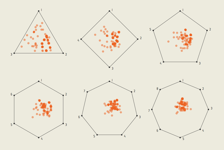 ,In the book we used only the triangle (3 topics) and square (4 topics) as there was no improvement in data distribution as we added more (they new topics were too weak or were just derivatives of the first 4).
 ,Clustering of couple of selected exhibitions
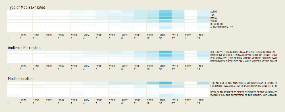
Media types
To show how type of media exhibited changes with the way the exhibition topic is approached we again used radial charts.
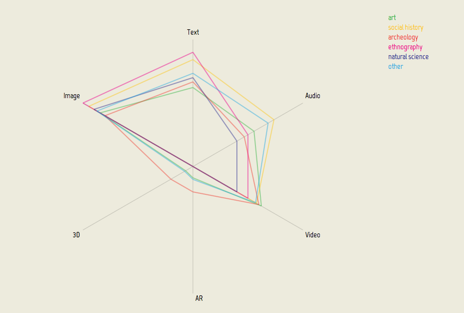 ,While ethnographic exhibition are still stuck with Video and Text archeology oriented ones are not afraid of playing with Augmented Reality and 3D models.
Export
All the selected visualization were then exported to SVG, tweaked in Adobe Illustrator and used in the final book.
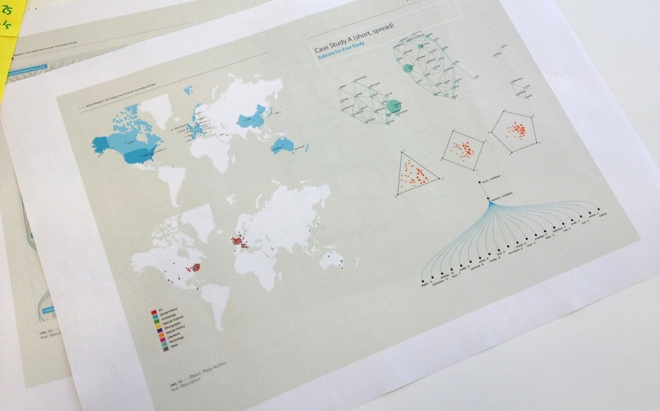 ,Test print