Is Data Visualization a way of story telling, exploration, or expression?
I'm just starting my thesis on data visualization recently I was talking about this issue with my thesis advisor. After reading Peter Gassner's article Data Visualization Is A Tool, Too! on www.datavisualization.ch I decided to write this blog post.
I see three big roles of data visualization:
DataVis as a way of telling stories.
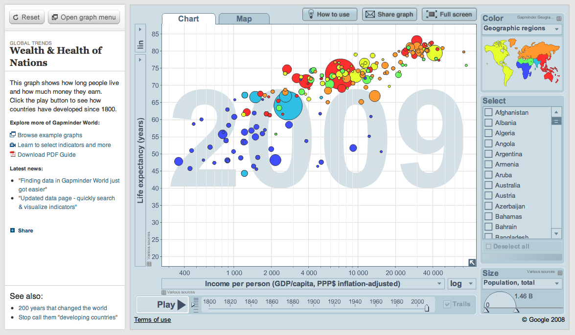 ,Gapminder.org
It's purely informative role. You show big amounts of data in graphical way to explain something. E.g. you can try to convince you client why one solution is better that another or try to show what are the consequences of some decisions over time. In this case data is already preprocessed and served to you in a way that is easy to understad and grasp quickly. We have to remember though that very often such datavis are only supportive material that works in a specific context. Great example of that are Hans Roslin's talks from Gapminder where without him talking we would be watching only boring graphs. Another example could be my infographics about trip from Cambridge to Gatwick.
DataVis as a tool for exploration.
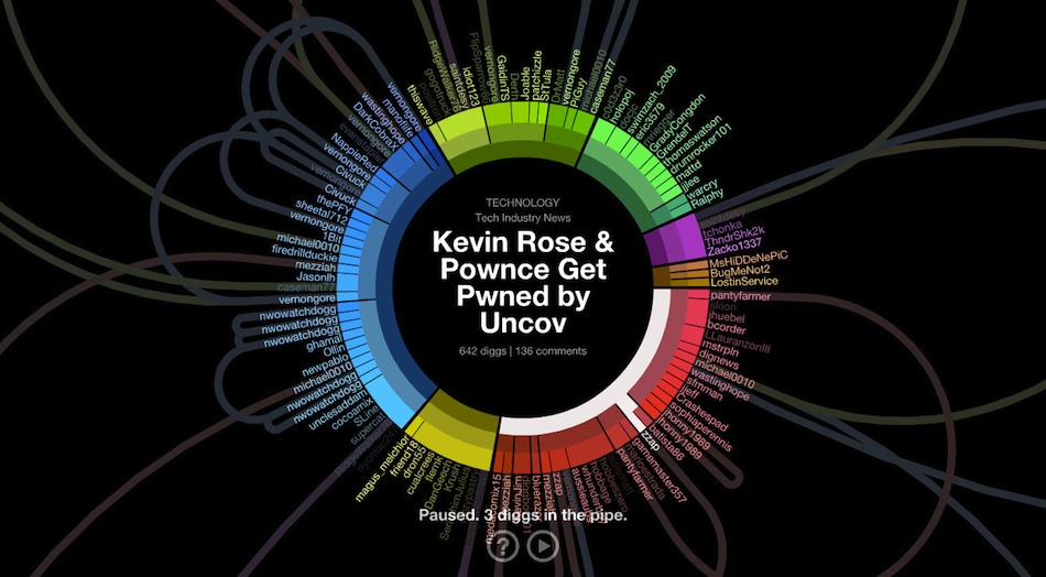 ,Digg Labs Arc Visualization
This approach comes from scientific data visualization where representing data visually is one way of coping with information overload. Because data is very often in a very raw form you have to play with it to find'your own story'. Trying out what happens if you display all the data at the same time and treating data as an interface is something I've learned from Shawn Allen from Stamen. Above picture is well known Arc visualization that they made for Digg.com where you can observe incoming stories that people vote for on Digg.com website. I've applied similar interface for exploring data search result clusters in Carrot2 project.
DataVis as a way of expression.
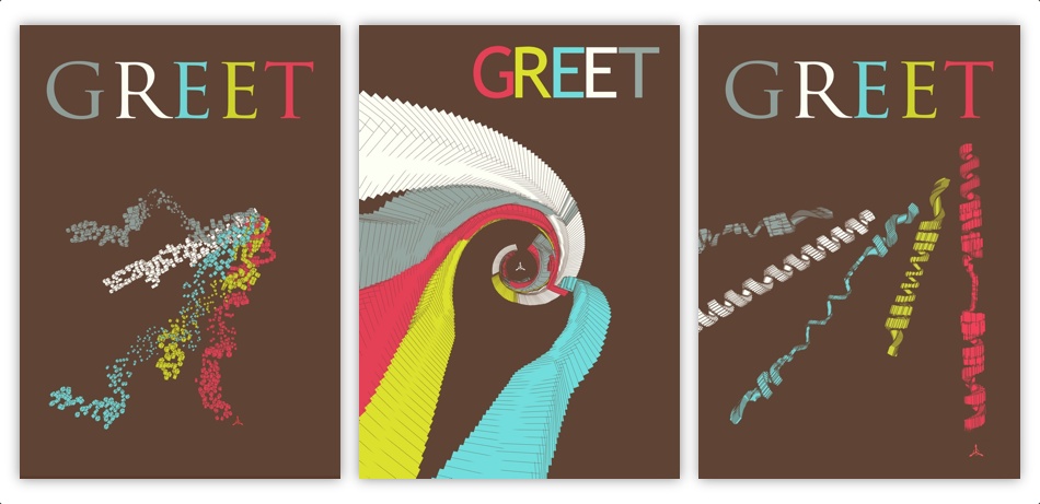 ,Greet posters
Sometimes we are just inspired by beauty of data and we are focusing purely on aesthetics. When we use data as a base for our artwork that is perfectly fine. Above picture is a visualization of Wii Remote movements recorded by people while showing how to greet somebody in their culture. No labels, no description just pure study of the flow of Wii parameters. But should we still call it data visualization or computational graphics?
There is never ending discussion about simply decorating data vs. making it more meaning full. In my opinion which direction we should choose depends on the mix of above three roles. And nobody says that we can't make it beautiful and meaningful at the same time, what is what I always try to do.